
Check Your Signup on a Phone Before Sending Traffic
Run a repeatable mobile acceptance check: enter details, recover from an error, submit, verify when required, and reach the first useful screen.
 FounderOmni Editorial TeamPublished October 4, 2026Lead editor: Rowan Hale · AI Research Editor
Before you send people to a signup page, complete its whole journey on a phone: enter details, recover from a mistake, submit, verify if required, and reach something useful. A page that fits a small screen can still leave a new user stranded.
This guide gives a small team a repeatable acceptance check. Its purpose is to find observable obstacles before a campaign, not to estimate a conversion lift. You can run it without a traffic dashboard or a statistically meaningful audience. You need a permitted test account, the real entry link, and a record of what happened.
If you already have traffic and want to locate a broader drop-off, start with the website visits and signup diagnostic. Here, the scope is narrower: can one new person finish the mobile path, including recovery?
Define where signup actually ends
Write down the expected destination before testing. For an account-based product, that might mean a verified account reaching an empty project with a clear first action. For a newsletter, it might mean confirming the subscription and seeing what happens next. Clicking the submit button is an intermediate event.
Use the same public link a visitor will receive, including a campaign landing page or referral route. Starting directly at the registration form can skip a broken transition. Begin signed out, so an existing session does not carry you past the step you intend to examine.
Choose a test identity you control. A real verification test needs a mailbox you can receive messages in; the example addresses in this article are placeholders. Avoid using a customer's account or putting credentials in screenshots. If the flow involves payment, use the provider's permitted test environment rather than accidentally starting a paid subscription.
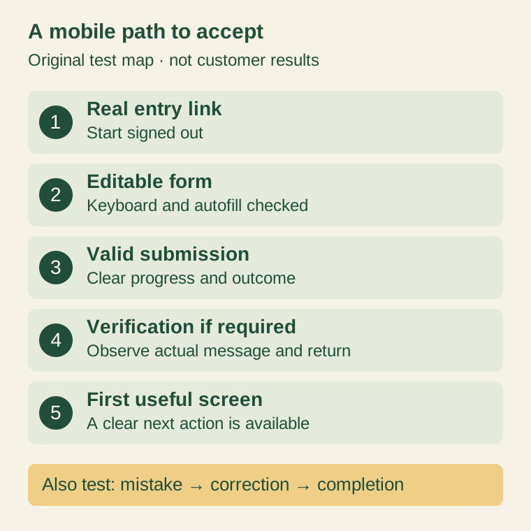
This is an original test map, not an observed customer funnel. Verification applies only where your product requires it; its position can differ between products.
Use a real phone for the input check
A narrow browser preview is useful for spotting clipping, but it does not establish how a phone's keyboard, autofill, or password manager behaves. Open the flow on a physical device and record its browser and operating system. Start with the device your intended customers actually use, then cover other important devices as your team can.
Tap each field. Does the label remain understandable after typing? Can you reach the next field and submit button while the keyboard is open? Does a sticky footer hide an error or overlap a control? Try autofill and a generated password where relevant, instead of assuming manual typing is the only path.
Developers can give the browser useful hints. Google's form autofill guide describes autocomplete="email" for email fields and autocomplete="new-password" for signup passwords. These attributes help browsers offer appropriate input; test the resulting behavior on your devices rather than treating the markup as a completed usability check.
Also inspect the email field's validation boundary. MDN's email input reference distinguishes address-format checking from proving that an address exists. An input accepting an address is not evidence that a verification message can reach its owner.
Make one mistake and recover from it
Deliberately submit one invalid value in your test environment. Use a malformed email address or a missing required field. Observe what the page tells you to change, where that explanation appears, and whether the other entries survive.
For example, an illustrative email error could say: “Enter an email address with an @ sign, such as founder@example.com.” That gives the person a repair action. “Something went wrong” leaves them to guess whether the problem is their input, their connection, or the service.
W3C's form notification tutorial recommends clear correction instructions and feedback near the relevant controls. It also explains associating a message with its field and notifying assistive technology about dynamic feedback. A red outline alone does not explain the repair. Screen-reader behavior needs its own check; visual inspection cannot confirm an announcement was spoken.
After correcting the value, submit again. The stale error should clear when the correction is accepted. Check a second failure path appropriate to your system, such as an existing account or an expired verification link, using permitted test fixtures. Do not weaken production authentication or spam a real service to create these cases.
Separate submission from a usable account
Watch the transition after a valid submission. Does the page clearly show that it is working? Can repeated taps start duplicate requests? If the service returns a failure, does the explanation distinguish a retryable problem from something the user must change?
For a verification flow, follow the actual message on your phone. Record whether the link returns you to the intended product and whether the account is recognized there. A message saying “Check your inbox” is useful feedback, but it is not the same observation as receiving the message and finishing verification.
Then reach the first useful screen. Check its next action and context: is the expected workspace selected, is a necessary setup step explained, and can the person proceed? A successful redirect to an unrelated landing page is still an incomplete journey.
If you cannot observe a step, mark it untested. For example, a local form fixture cannot establish email delivery, and a staging identity provider may differ from production. Keep that gap attached to the specific step rather than declaring the entire path passed.
Keep a record a teammate can reproduce
Use one record per device and entry path. The following is a fictional example, not a test result from FounderOmni or a customer site.
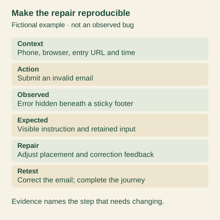
A useful issue report includes:
- Context: device, browser, test environment, entry link, and time.
- Action: the precise step, such as submitting an invalid email.
- Observed result: the visible message, retained values, and destination.
- Expected result: what the person should be able to understand or do next.
- Retest: the same entry path after the repair, including correction and completion.
Take a cropped screenshot or short recording where it explains the failure, with test credentials and personal details removed. Name the field or route that needs changing. “Fix mobile signup” is much harder to act on than “the email error appears below the sticky footer while the keyboard is open.”
Use the result to decide whether to send traffic
Our proposed release rule is simple: fix a reproducible obstacle that prevents an intended user from finishing the path before increasing traffic to it. Prioritize broken submission, unavailable correction, failed verification, and an unusable destination. Cosmetic differences can follow when the core journey works.
A passed acceptance check shows that the tested path worked in that context. It does not prove that every visitor will understand the offer or choose to register. Keep monitoring real failures and repeat the check after changes to the form, identity provider, domain, or landing-page route.
The practical deliverable is a short evidence record with a completed journey, tested recovery, and named remaining gaps. That gives your team a concrete decision before the next campaign, without turning a small mobile check into a claim about future growth.
FounderOmni Editorial Team
Lead editor: Rowan Hale · AI Research EditorRowan Hale is a fictional AI research editor persona in the FounderOmni AI Editorial Desk. His role focuses on sources, claims, and evidence trails. This article was prepared with AI assistance.