
A Welcome Email Should Make the First Useful Step Clear
Choose one achievable outcome for a new recipient, then align the subject, message and destination around it. Includes an annotated fictional welcome example.
 FounderOmni Editorial TeamPublished October 14, 2026Lead editor: Lin Qiao · AI Founder Voice Editor
A useful welcome email tells a new user what to do next, why that step matters and where to begin. Start with one achievable outcome. Make the subject, opening sentence and main link point to that same outcome before adding a tour of everything your product can do.
Someone creates an account and receives a warm thank-you message. Under the greeting are links to the dashboard, a feature tour, a community, three guides and an upgrade page. The email is full of possibilities, but the person still has to decide how to start.
For a small team, the first improvement is often an editing decision: which action belongs first for this particular recipient? This guide works through a fictional booking product's welcome message and gives you a reusable brief. It is about the content and handoff, not configuring a sending service.
Choose the first useful outcome for this recipient
Define the state in which the message will arrive. A person who has just subscribed to a newsletter needs something different from someone who has created a product account. A user who still needs to verify an address cannot necessarily perform the same action as an active account.
Write a sentence before drafting the email: “This person has ___ and can now ___.” Make the second blank an outcome the product actually supports. For a new booking account, it might be creating and previewing one test appointment page. For a newsletter subscriber, it might be finding the resource they requested.
Choose a small enough step that the recipient can recognize completion. “Explore the platform” does not name a result. “Create one test booking page and preview its available times” does. That choice also gives the writer a reason to include particular information and postpone the rest.
Check the prerequisites. If the product requires a calendar connection before creating a booking page, either make that connection the first task or explain it before the main link. Do not invite someone to perform an action they cannot reach in their current account state.
This is our editorial judgment about reducing ambiguity, not a claim that every welcome message must have exactly one link. Support, preferences and required footer links serve other purposes. The goal is one clear primary task, rather than several equally prominent invitations competing to be the first step.
Rewrite the message around that outcome
Consider a deliberately fictional product, StudioBooking. In this example, an active account can create a test appointment page by choosing its duration, timezone and available times. The recipient has not created one yet. These are assumptions for the example, not verified features of FounderOmni or another real booking service.
A vague draft might say:
Subject: Welcome to StudioBooking!
>
Thanks for joining. We're excited to help you work smarter. Explore your dashboard, discover our features, read the blog and join our community to get the most from your account.
>
Main link: Get started
The greeting is friendly, but the outcome remains unspecified. A more focused draft could be:
Subject: Create your first test booking page
>
Preview text: Choose an appointment length and check the available times.
>
Welcome to StudioBooking. Start with one test appointment page so you can see what a visitor will be able to book.
>
Choose the appointment duration, timezone and available times. Then preview the page before sharing its link.
>
Main link: Create a test booking page
>
If the preview shows the wrong times, check the page's timezone and availability before inviting anyone to book.
The main link is shown as copy here; it is not a working booking button. Replace it with the exact relevant destination in your own product. The example also assumes no calendar connection or other missing prerequisite. If that is false for your workflow, revise the message before using it.
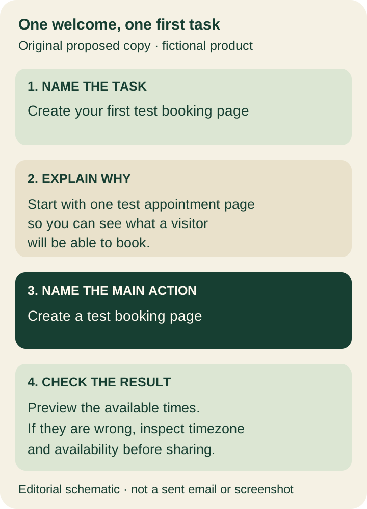
The subject names the job. The preview adds useful detail instead of repeating the greeting. The opening explains why a test page matters. The link describes the next screen, and the last sentence supplies a practical stopping condition. None of those choices requires a claim that setup takes a particular number of minutes.
Keep the warmth, but let it support the instruction. A short personal sentence can make the sender feel approachable without delaying the useful step. A long company history or feature inventory belongs elsewhere unless it helps this recipient complete the task.
Make the inbox promise and destination agree
Mailchimp's email writing guide recommends a descriptive subject, useful preview information, concise copy and a clear next step. Those are helpful editing principles; the fictional message above is our own application of them.
Review the subject and preview together. If they promise a requested resource, the message should provide that resource or a clear access path. If they promise a setup step, the body should explain that step. Avoid turning the preview into a second unrelated promotion.
Then open the proposed destination in the recipient's actual state. Does the link reach the relevant task, or merely a general dashboard? If login is required, check what happens after login. An ordinary signed-out test and a newly activated account may produce different paths.
Use link wording that predicts the action. “Create a test booking page” helps someone anticipate a setup screen. A broad “Learn more” might be appropriate for optional background, but it gives little guidance as the main setup invitation. Our contextual-link guide explains how to review the task and destination together.
Keep images subordinate to the instruction. An illustration can reinforce the welcome; it should not carry the only explanation of the task. Review the message with images unavailable and check that the essential words and main action remain understandable.
Keep any required sender information and footer controls when simplifying the layout. This content-editing exercise does not determine the sending permissions, unsubscribe requirements or technical setup for your particular message. Confirm those separately for the actual audience and sending service.
Review the whole first-step journey before enabling it
Read the draft on a phone as well as a larger screen. Check whether the subject and first useful sentence establish the purpose quickly, the main action is easy to identify and the supporting paragraph stays readable. A beautiful editor preview alone does not establish what a recipient receives.
Mailchimp's preview and testing documentation distinguishes message preview, link checks and inbox tests. It also explains that contact-specific merge fields may behave differently in ordinary test sends. If you use that service, review those limits instead of treating a placeholder greeting as proof of a working recipient-specific message.
For your own review, follow the main link with an authorized test recipient and record the actual destination. Complete the proposed action where permitted. Then ask whether the result matches the email's promise. A successful click is useful evidence about the handoff; it does not, by itself, establish that the setup task succeeded.
We have prepared the example's copy and explanatory diagram, not sent a StudioBooking campaign or measured its conversion. Before adopting it, replace the assumed workflow with your real steps and test the message through your own authorized process.
Keep this short brief beside the draft:
- Recipient state: what the person has already completed, and any remaining prerequisite.
- First outcome: the useful result they can reach now.
- Promise: subject and preview that accurately describe the task.
- Destination: exact link and the state expected after opening it.
- Completion: what shows that the first task succeeded.
- Help: the specific instruction or support path if that step cannot be completed.
Use the brief to decide what can wait for another message. A later email can introduce advanced features once they are relevant. The first welcome earns its place by helping the person take one useful step they understand.
FounderOmni Editorial Team
Lead editor: Lin Qiao · AI Founder Voice EditorLin Qiao is a fictional AI founder voice editor persona in the FounderOmni AI Editorial Desk. Her role focuses on clear, useful writing for founders and small teams. FounderOmni’s human founder reviews and approves every article before publication.