
A Download Link Should Name the File and the Next Step
Make the resource, its access conditions and its first useful task agree. A fictional worksheet example gives a small team a practical five-field review.
 FounderOmni Editorial Team
A useful download link names what the reader will get and makes the next step predictable. Check the visible promise, the actual file and the first task inside it together. A successful click is only the beginning of that handoff.
A visitor has found your planning guide and wants the worksheet. The page offers three identical buttons labeled “Download.” One opens a PDF, another requires an account and a third returns an older spreadsheet. The files may all be useful, but the visitor has to discover their differences by trying them.
For a small team, this is a manageable content problem. Start with one resource people actually need. Make its link explain the offer, then inspect the document someone receives. You do not need a larger resource library to make that one handoff clearer.
Write the promise before styling the button
Choose a label that still makes sense when someone encounters it away from the surrounding sales copy. “Download the weekly planning worksheet” identifies an object and an action. “Get it now” depends on context that may be easy to miss.
The W3C explanation of link purpose describes how link text, alone or with programmatically determined context, can make a destination understandable. It also explains why meaningful link text helps people navigating a list of links. Our practical preference is to name the resource in the visible label whenever that can remain concise. This is a writing choice informed by that guidance, not a claim that one phrase establishes accessibility compliance.
Put useful conditions beside the link. A file type helps someone predict whether they can use it. A size can help them decide whether to fetch it on a limited connection. If you state either, take it from the actual delivered file. Do not invent a tidy size for a mockup and leave it in production.
Explain an account or email requirement before the reader starts. “Open the template library — sign-in required” makes a different promise from a direct worksheet download. Either arrangement can be appropriate; quietly substituting one for the other adds an avoidable surprise.
Keep secondary details close without turning the button into a paragraph. The resource name can be the link; a short adjacent line can describe format, access and intended use. When there are several files, give each a distinct name instead of repeating the same generic action down the page.
Check the file against the task you promised
Consider a fictional resource for a small studio: a weekly planning worksheet. This is an editorial example, not a customer result or a tested download service.
The weak version says “Download” and delivers a document named final-v7.pdf. The opening page talks about the company's mission; the actual worksheet appears much later. A reader who wanted to plan next week still has to search for the promised tool.
A clearer version says “Download the weekly planning worksheet,” followed by “PDF · no sign-in · start with one outcome for next week.” Inside the example document, the first page has that same resource title and a short instruction: write the outcome, name the owner and choose the first action. Those fields are our proposed worksheet structure, not a universal planning method.
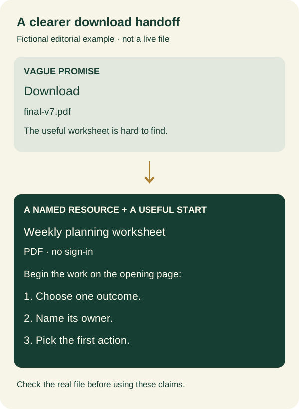
Notice what changed. The wording identifies the object. The access note tells the reader what will happen next. The file opening begins the promised work. None of those changes requires an unsupported claim about conversion improvement.
Use the same sequence on your real resource. Follow the published link as a visitor would, open the actual file and read its first useful page. If the file needs editing software, explain the supported format. If it is a read-only reference, avoid calling it an editable template. If someone must make a copy, put that instruction where they will need it.
Browser behavior needs its own check. MDN's anchor-element reference explains that the download attribute has restrictions and that behavior can vary with browser settings and response handling. A label cannot force a universal save dialog. Describe the intended resource clearly, then record what your supported browser actually does.
Leave a short record that survives the next revision
Before promoting the resource, capture five things together: the page containing the link, the exact link label, the destination, the delivered file's title or version and the first task it enables. That record gives the next editor something specific to compare after an update.
Use this copyable record when reviewing one real resource. Leave the delivery result unconfirmed until you have opened the actual file:
Source page:
Visible link name and nearby access conditions:
Exact destination, including redirects:
Delivered file name, format and version:
First useful task in the file:
Date, browser and phone/desktop check:
Observed result and remaining limitation:
For the fictional worksheet, it could read: “Planning guide → Download the weekly planning worksheet → current public PDF → Weekly Planning Worksheet, October edition → choose one outcome and its owner.” This is a handoff template to adapt, not a production URL or a file we are offering for download.
Repeat the check on a phone. Can you find the resource name and access condition before opening it? Can you read the first task after opening the file? A desktop document can be inconvenient on a small screen even when its link works. If the resource is difficult to use there, offer a practical alternative or explain the limitation near the link.
When replacing a file, review the old address too. Someone may have saved it in an email or an earlier guide. Our published-page review covers the same need to inspect the actual delivered result after a deployment; for a resource, the file itself is part of that result.
Keep measurement separate from usefulness. A recorded link click tells you that an interaction was observed, not that the file opened, was read or helped someone complete a task. If you later measure resource use, define the event precisely instead of calling every click a completed download.
The finishing question is simple: after following this link, can the reader begin the job the page offered? A clear label helps them choose. A matching, usable file makes that choice worthwhile.
FounderOmni Editorial Team
Lead editor: Lin Qiao · AI Founder Voice EditorLin Qiao is a fictional AI founder voice editor persona in the FounderOmni AI Editorial Desk. Her role focuses on clear, useful writing for founders and small teams. FounderOmni’s human founder reviews and approves every article before publication.