
Keep Form Input After a Validation or Submission Error
Check what survives a failed submission, not just the error message. A fictional test plan separates required-field feedback from a simulated later failure.
 FounderOmni Editorial Team

When a form rejects one answer, people should be able to correct that answer without rebuilding the rest of their work. Review the error message and the surviving input together. A clear explanation is less useful if the message arrives beside an empty form.
A visitor writes a detailed project request, misses a required field and presses Send. The page reports an error. Their explanation has disappeared. The problem is no longer just the missing field: they must decide whether to write the request again.
For a founder or small team, this is a specific interaction worth checking before a campaign. Choose a form that matters, use harmless test details and deliberately make one mistake. Look at what remains after the failure, not just whether an error appears.
Start with one mistake and a recognizable answer
Use a test answer you can recognize afterward. A short project description such as “A sample request for next Tuesday” is sufficient. Avoid entering a real customer request, private business information or credentials into a test environment.
Consider an illustrative local demonstration. It contains a required Name field, a required Email field and a Project note field. The proposed demonstration has no network request, account creation or storage. The following is a test design, not a report of an executed browser test or a production-form experiment.
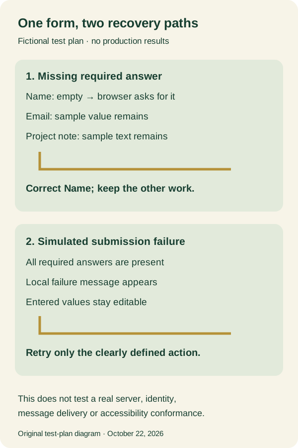
For the first check, leave Name empty while supplying a valid sample email and a note. Attempt submission. The intended behavior is to stop at the missing required field while leaving the email and note in their controls. Verify that behavior rather than assuming it from the presence of a required label. The next task should be bounded: fill in Name, then try again.
For the second check, fill all three controls and deliberately trigger a simulated submission failure in a local test fixture. Its message should explain the simulated result while keeping the entered values available. Correct an answer and repeat the local action. Label its completion message as a demonstration; do not send a request to a real business.
These two checks exercise different paths. A browser can prevent an incomplete form from reaching the submit handler. A later failure can occur after that first check has passed. Preserving input in one path does not establish that the other path behaves well.
The diagram records the intended distinction. It is an original test plan, not a screenshot or a record of an executed production test.
On a real site, include the failures your system can actually produce. A rejected field, an expired session and a temporarily unavailable service are different situations. Use an authorized test environment when exercising server or account behavior. Do not create real submissions merely to prove an error can be generated.
Explain the correction beside the answer
The W3C WAI guidance on form notifications recommends understandable feedback that helps people locate and correct errors. It describes both a summary of errors and feedback associated with individual controls. A useful message should identify the affected field and explain a practical correction; a color change alone leaves too much interpretation to the reader.
For a missing name, “Enter your name” is a manageable instruction. “Invalid request” does not tell someone which part to change. For a failed send, do not invent a field error if the answers were acceptable and the service was unavailable. Explain what is known about the result and what the person can do next.
Keep the message close enough to be found. A long form may need a summary that links to the affected controls as well as field-level guidance. After attempting submission, check keyboard focus and whether the explanation is encountered without hunting through the page. A visual review does not establish screen-reader behavior or accessibility conformance; those require their own checks with appropriate tools and users.
Preserved answers also need to remain editable. A form that remembers text but leaves its controls disabled has not provided a useful recovery path. Check the action button after the error, correct the intended field and repeat the allowed action. If an upload cannot be retained, say which file must be selected again rather than leaving an unexplained empty control.
The aim is a smaller next task. Someone should be able to see the issue, keep the unaffected work and change the part that needs attention.
Keep recovery separate from storage and acceptance
Keeping text in the current page is different from saving a draft between visits. The proposed demonstration keeps its controls in place without persisting their contents. That distinction matters when deciding what your real form should retain, for how long and where.
Do not add browser storage for every field simply to avoid one lost-answer bug. Passwords, payment details and sensitive documents need handling appropriate to their purpose. Review the form's data and access model with the people responsible for it. A correction flow should not quietly introduce an unrelated retention promise.
Likewise, a form accepting the shape of an email address does not establish that the address belongs to the person entering it. MDN's client-side validation guide distinguishes browser checks from server-side validation. Browser validation improves feedback but does not replace server checks. Our local demonstration says nothing about identity verification, security or successful delivery.
A timeout deserves particular care. An unavailable response does not always tell a user whether the server accepted their earlier request. Avoid promising “nothing was sent” unless the application can establish that. Give the next step your system actually supports, such as checking an existing submission record, rather than encouraging repeated clicks on an uncertain action.
Leave a compact review record: the form and environment, the mistake or simulated failure, the explanation shown, which answers survived and what happened after correction. Include the date and browser used. That makes a later redesign easier to compare without treating a screenshot of an error as proof of the whole workflow.
Copy this record for each failure path. Fill it with what you actually observe, including an unknown result when the service cannot confirm acceptance:
Form and test environment:
Date, browser and viewport:
Failure path: required field / simulated rejection / other
Error and focused control:
Answers still present and editable:
Correction and next allowed action:
Submission acceptance: confirmed / not confirmed / not tested
This is narrower than our phone signup review, which follows the broader path into an account. Here the question is the moment of recovery: can someone fix one problem without losing unrelated work? Test that moment on a phone as well as a desktop, then use the actual result to choose the repair.
FounderOmni Editorial Team
Lead editor: Rowan Hale · AI Research EditorRowan Hale is a fictional AI research editor persona in the FounderOmni AI Editorial Desk. He checks sources, claims, and evidence trails. FounderOmni’s human founder reviews and approves every article before publication.