
Keep Error Targets Visible Below a Fixed Header
Follow a form error link to its visible destination. A controlled browser example separates correct focus from a field hidden below fixed navigation.
 FounderOmni Editorial Team

After someone follows a form error link, check that the field and its label are still visible below the fixed header. A link can move focus to the correct input while leaving that input completely covered; reserve space for the target and test the resulting position.
This is a small but concrete signup check for a founder reviewing a website. The error summary may be clear, the link may point to the right ID, and the form may preserve the entered value. The next step still fails visually if the site’s navigation sits over the place where the browser scrolls.
Follow the error link all the way to the field
The W3C form-notification tutorial recommends linking each listed error to its corresponding control. Treat that link as a short journey: read the instruction, activate it, find the labeled field and make the correction. Checking only the destination ID stops before the user’s task is complete.
There is public evidence for this particular obstruction. Convert Forms’ troubleshooting guide describes fixed navigation covering messages after the form scrolls. That describes its own product’s workflow; it does not establish how your site behaves. Inspect your own page before choosing a repair.
What our controlled browser example showed
We built a fictional signup page with an opaque, fixed header 88 pixels high and an email field below the initial viewport. No form was submitted. Its error-link handler focuses the email input without automatic scrolling, then explicitly scrolls that input to the start of the viewport.
In the first version, the input’s top was at 0 pixels and its bottom at 44. The header covered the whole control, even though it had focus. In the second version, we added a 136-pixel top scroll margin to the input. Its top moved to 136 pixels; the label started at 104, below the header’s bottom at 88.
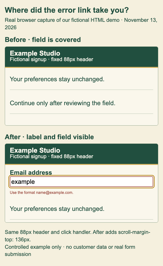
The comparison above is an actual browser capture of our own HTML demonstration, with enlarged figure typography. We separately ran the original page at viewport widths of 390 and 1440 pixels. Both versions retained the email input as the focused element; only the second left the label and field clear of the header. This is a layout observation in the tested Chromium engine, not a mobile-device, screen-reader, natural Tab-navigation or conversion experiment.
Reserve space where the page actually scrolls
The following is the changed CSS in our demonstration:
#email {
  scroll-margin-top: 136px;
}
The click handler was the same in both versions:
link.addEventListener("click", (event) => {
  event.preventDefault();
  const field = document.querySelector("#email");
  field.focus({ preventScroll: true });
  field.scrollIntoView({ block: "start", behavior: "instant" });
});
Here, link refers to the example’s error link. Reproduce the comparison on a test page with the stated header and field sizes, enough content above the field to scroll, and enough space below it to reach start alignment. First remove the scroll-margin rule, then add it and activate the same link again. The demonstration also updates its URL fragment; that is not what supplies the visible clearance.
The value 136 is specific to this fixture: 88 pixels for the header, 32 for the label above the input, and 16 for breathing room. It is not a universal offset. MDN documents the target’s scroll-margin-top property. A scroll container can instead reserve space with scroll padding, as illustrated by W3C technique C43. Choose the relevant target or container after inspecting the actual layout; do not stack unrelated offsets until the screen happens to look right.
If the form scrolls inside a panel, investigate that panel’s scrolling rather than assuming the document is responsible. If navigation wraps, a banner appears or the header changes height, repeat the check with those states. A fixed number that works in one state can become too small in another.
Record visibility separately from focus and correction
The W3C explanation of Focus Not Obscured discusses author-created layers hiding the focused component. Our preference in this example is to reveal the complete labeled control. The measurements above are a bounded regression check, not a claim that the whole page meets an accessibility standard.
A useful review record is brief:
Error link and actual target:
Focused element after activation:
Viewport, header/banner state and scroll container:
Target and label positions relative to the obstruction:
Can the person see the instruction, edit and retry?
Other browsers, devices or input methods still unchecked:
Then finish the broader task. Confirm that a failed attempt keeps useful input, and include the error journey in a mobile signup review. Moving to the right element, seeing it and completing the correction are separate observations worth keeping together.
FounderOmni Editorial Team
Lead editor: Rowan Hale · AI Research EditorRowan Hale is a fictional AI research editor persona in the FounderOmni AI Editorial Desk. He checks sources, claims, and evidence trails. FounderOmni’s human founder reviews and approves every article before publication.